Our Vision
Our Vision
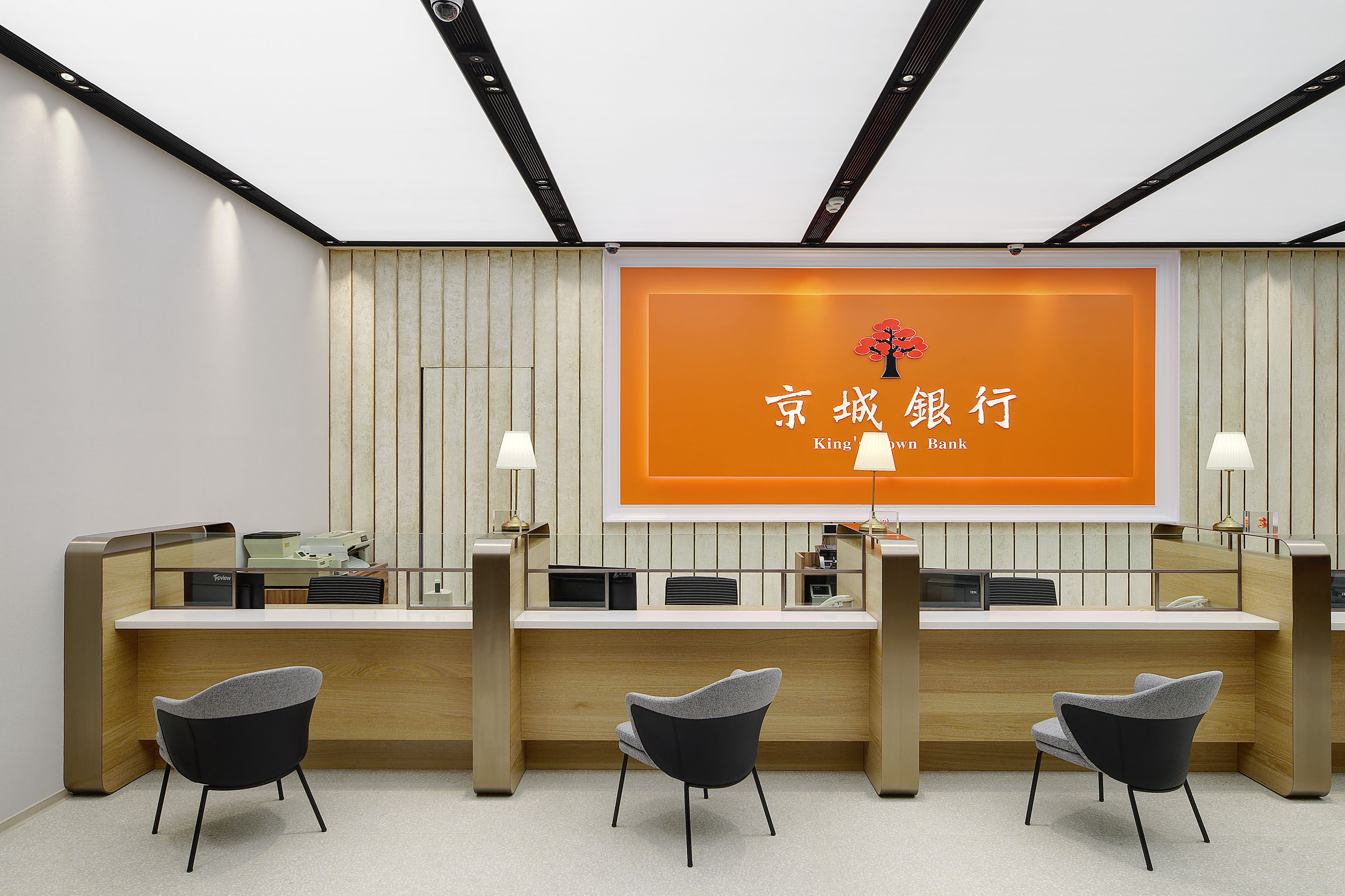
The corporate logo of King's Town Bank - "Flame Tree" is a flowering tree unique to southern Taiwan, symbolizing that KTB originated from southern Taiwan. The flaming red petals represent the entrepreneurial spirit of KTB's passion for service; the strong and sturdy tree truck represents our business philosophy of being entrenched in the local market. The corporate typeface of "King's Town Bank" is Wei Bei. This typeface originated from stone rubbing from ancient epigrapher's carvings. Its bold and dynamic strokes embody strength and vitality, reflecting the principle upheld by KTB "King's Town Bank will move mountains."
Our corporate philosophy is to persist in creating a "different bank." In the rapidly changing financial environment, we root ourselves in the local community while integrating innovative thinking, and forge the unique financial value of KTB. We clearly understand our strengths and positions, thoroughly comprehend customer needs, carefully assess the potential risks of every transaction, and integrate sustainable development into our company's operations strategies. We are committed to making society better through the presence of KTB.
As our customer base is largely concentrated in Yunlin-Chiayi-Tainan area, many of our branches are located in districts with a population of only a few thousand. As a "local bank," taking care of the surrounding communities is both our mission and our responsibility. In 2017, we partnered with a local Tainan illustrator and created KTB's mascot - an owl (later named "Guchiu"), symbolizing professionalism, justice, and diligence. In 2020, with the launch of the international transmission service "King's Pay," a new mascot "Wuchiu" was born. Its dominant vivid yellow color and the W-shaped bang on the forehead symbolize the close cooperation between KTB and Western Union, providing customers with borderless, timely, and convenient remittance service but also conveys their longing for distant family members.
We hope that through the two endearing mascots, "Guchiu" and "Wuchiu," financial services will no longer be perceived as mere cold numbers, but rather as a warm current filled with positive energy. This initiative aims to bridge the gap between us and our clients, allowing every individual who walks into KTB and every customer who places their trust in KTB to experience a sense of "local connection" and to enjoy a uniquely friendly financial service.